Clear space
Keep clear space around the logo equal to the height of the tulip head on all four sides. Keep text, photos and other logos out of this space.
Brand guide
The Alkmaar Farms LLC identity. We sell trees and write software, and the logo needs to represent both.
The mark
Concept
Three petals. The tulip stands for the family, and the rest of the mark is built around it.
The stem runs like a trace on a board, with square elbows instead of a natural curve.
The left branch ends in a leaf, for the tree nursery.
The right branch ends in a Delft blue solder point, for the software.
Both branches grow from the same stem.
Lockups
Four approved forms. Use the stacked lockup wherever there is room; it is the primary. Always use the supplied files rather than rebuilding a lockup by hand.
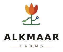
Primary · stacked

Horizontal · headers & signage

Reversed · dark backgrounds

Mark alone · avatars, favicons, stamps
Keep clear space around the logo equal to the height of the tulip head on all four sides. Keep text, photos and other logos out of this space.
Stacked lockup: 34 mm / 130 px wide. Horizontal: 40 mm / 150 px wide. Mark alone: 16 px. Below that, the node and leaf get too small to see, so use the mark on its own.
Color
The warm orchard colors make up most of the brand. Delft blue is used sparingly, only for software, so it stands out.
#D95F2BPrimary accent. Buttons, links, eyebrows.#B23A26Deep petal. Supporting accent, never body text.#E0A038Third petal. Highlights and warm detail.#3E6B4AStem and soil line. The farming half.#6E9B62Lighter growth. Icons and fills.#23457CThe node. Software surfaces only.#16294CDark backgrounds for software sections.#F7F0E1Warm ground. The default page feel.#1F1B16Headlines, dark bands, footer.#5C5346Secondary text and quiet labels.Typography
Aa
Persimmon & pawpaw
Aa
Fruit trees from a small family farm
Aa
SEASON 2026 · ZONE 7A
The monospace font is for data, regulations, season dates and other technical labels. Use it for short labels only, never for paragraphs.
Usage
Files
All files are vector SVGs, so they scale to any size
without losing quality. Files live in assets/img/logo/.
Primary lockup. Mark above the wordmark.
Wide lockup for headers, letterhead and signage.
Reversed wide lockup for dark backgrounds.
Full-color mark on its own.
Single-color mark for embroidery, stamps and engraving.
Badged mark for browser tabs and app icons.
The wordmark in the SVG lockups references Fraunces and falls back to a serif when the font is unavailable. For print, ask for a copy with the type converted to outlines.